I’ve been trying to figure out how to approach this one without falling into the usual trap. When you have a close relationship with a brand, when the founder is not just a contact but a friend, and when you’ve already collaborated on something like the AC1, there’s always that risk of losing distance. You either become too careful, or worse, too generous.
So let’s get this out of the way early. Yes, Alex Anders is a friend. Yes, Time-Telling worked with Anders & Co. last year on the AC1. And yes, there are things coming that I’m genuinely excited about. But none of that matters if the watch doesn’t hold up on its own.
The AC2 Volcán does. Not perfectly, not universally, but honestly. And that’s why it’s worth talking about properly. ** Find the specs below.
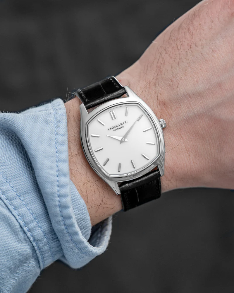
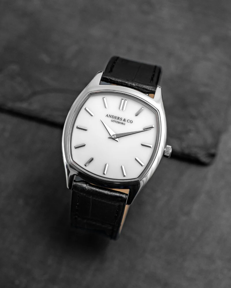
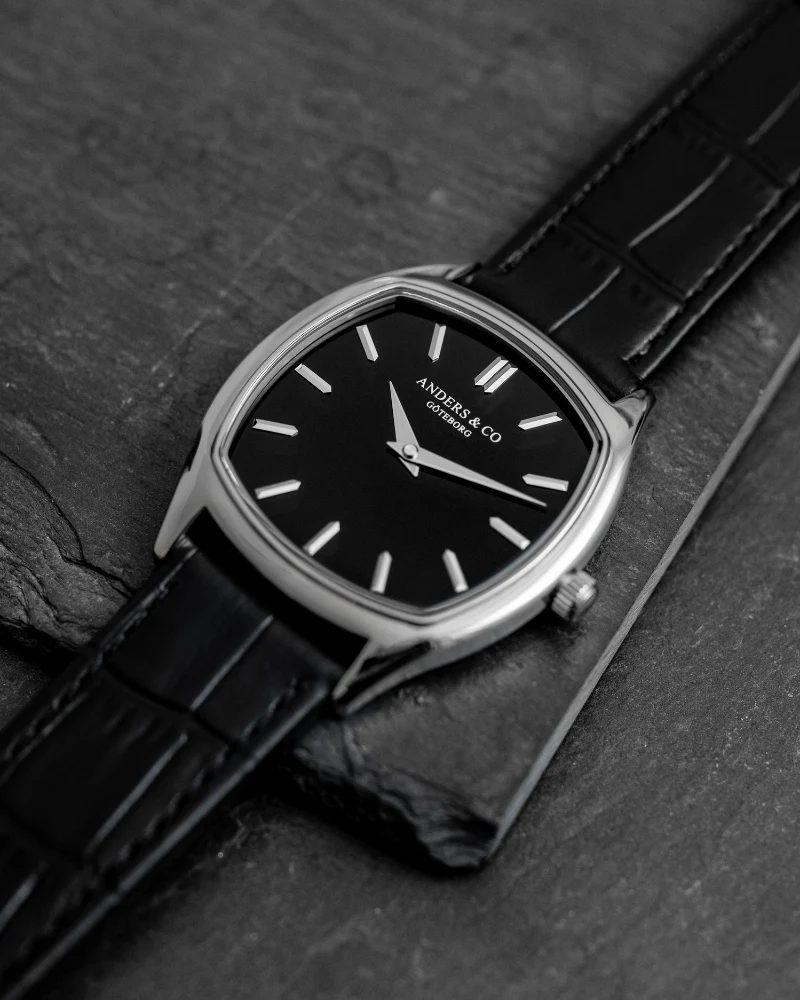
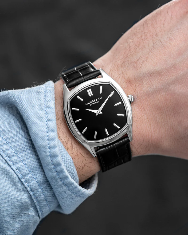
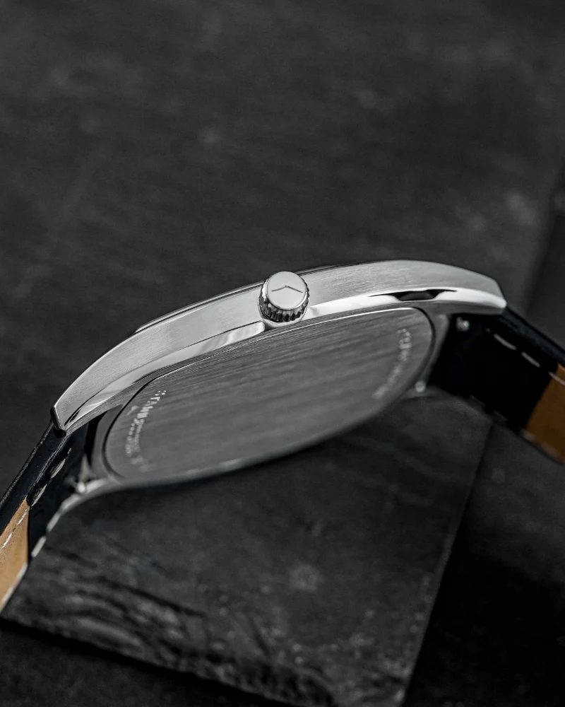
The AC2 as a platform is already familiar if you’ve spent time with the AC1. In spirit I mean. Same philosophy of controlled proportions, same refusal to over-design, same focus on the dial as the real point of tension. The case remains restrained, wearable, almost deliberately neutral. It doesn’t try to compete with the dial. It frames it.
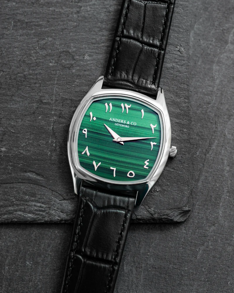
Where the Volcán series shifts things is in how far Anders & Co. are willing to push material and contrast without losing that restraint. Three versions, three completely different readings of the same watch: white porcelain, black onyx, and green with Western Arabic numerals. On paper, that sounds like a simple variation exercise. In reality, each one behaves differently enough to almost feel like its own watch.
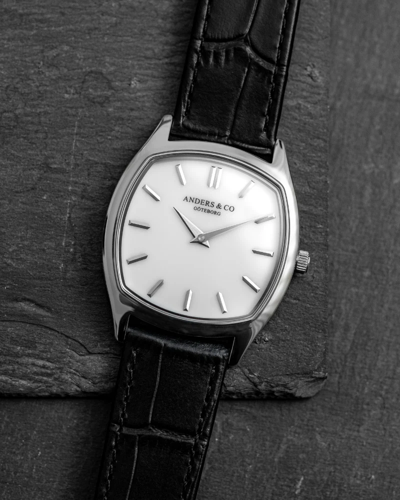
The white porcelain is probably the most deceptive of the three. At first glance, it feels classical. Clean, almost safe. But once you spend time with it, you start noticing how unforgiving porcelain actually is. There’s nowhere to hide. The surface is glossy, almost liquid, and every index, every print detail sits on top of it with surgical clarity. This is not enamel trying to imitate vintage softness. This is something sharper, colder, more precise.
What works here is the tension between that purity and the rest of the watch. The case doesn’t romanticize it. The typography doesn’t overreach. It just lets the material do its job. If anything, this is the version that requires the most discipline from the wearer. It doesn’t give you personality. You bring it.
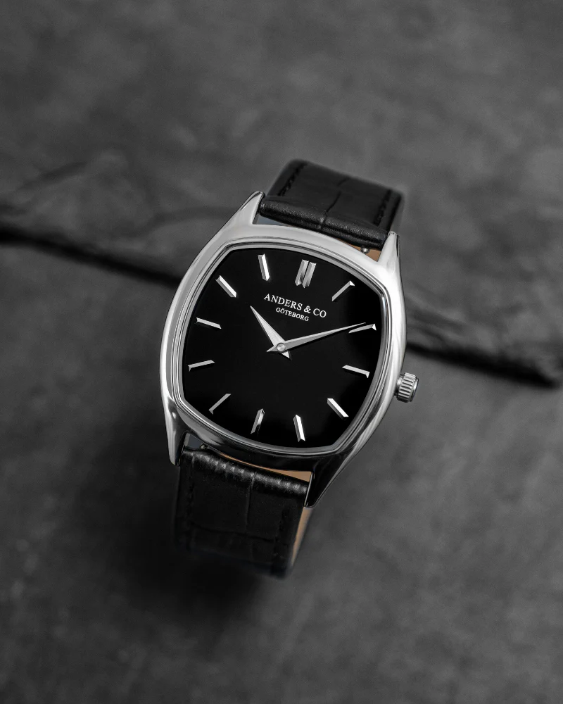
The black onyx is the opposite. Immediate, dense, almost confrontational in the way it absorbs light. Onyx has that quality where it doesn’t reflect much, it just sits there, deep and flat, almost like a void. This changes the entire reading of the watch. The hands feel sharper. The contrast is stronger. The watch feels more compact visually, even if the dimensions haven’t changed.
This is probably the most “emotional” of the three, if that word even makes sense here. It reacts more. It gives more back. But it also risks being too much depending on how you wear it. This is not the safe choice, and it’s clearly not meant to be.
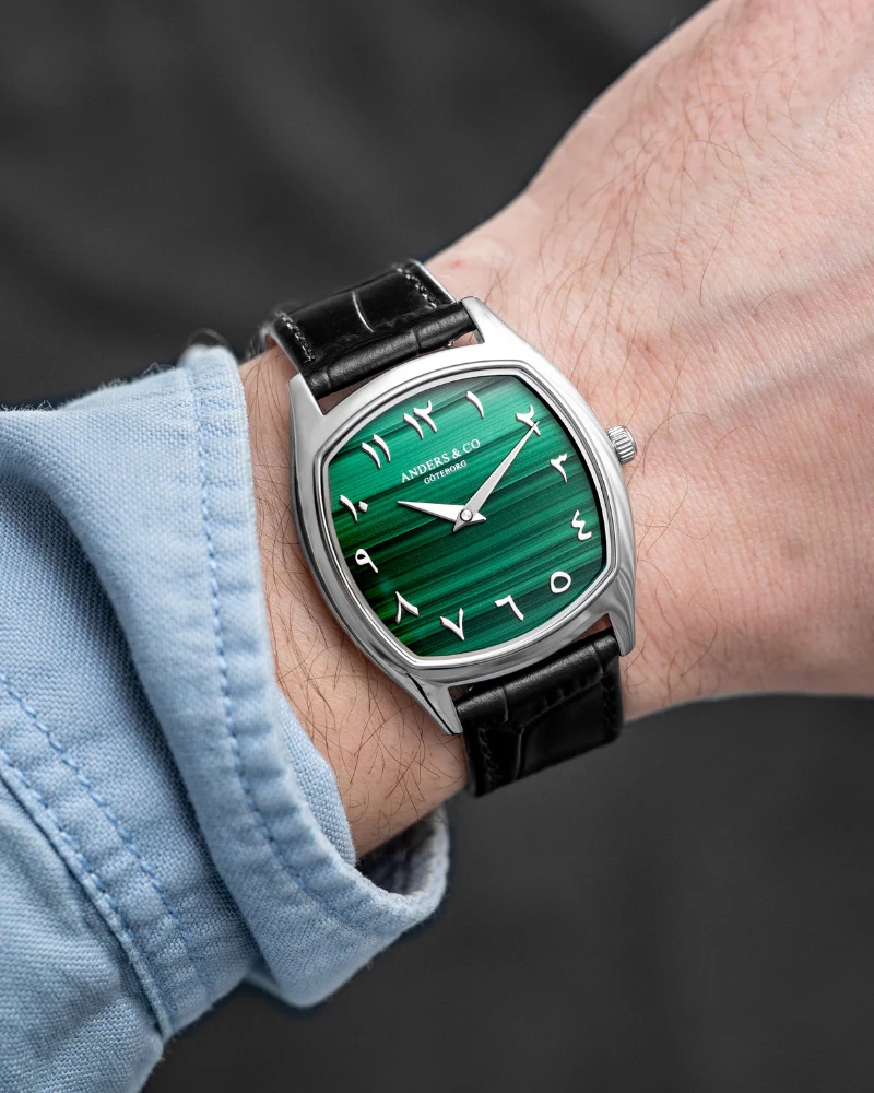
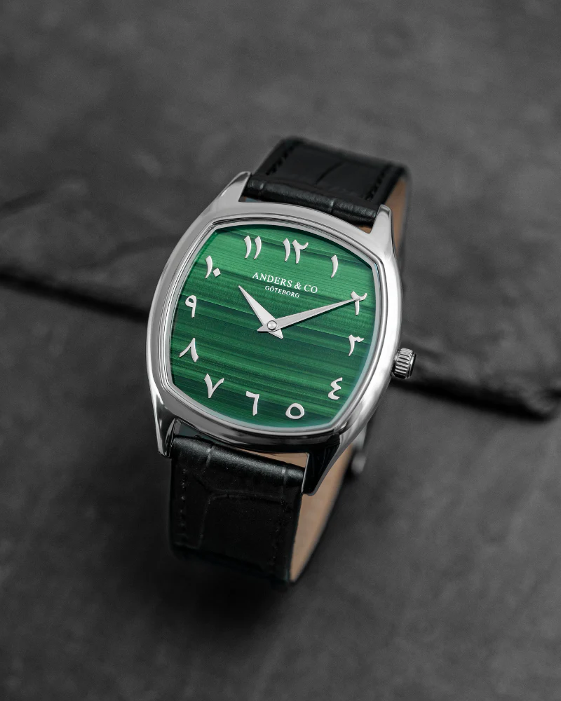
Then there’s the green with Western Arabic numerals, which I didn’t expect to like as much as I do. Green dials are everywhere right now, and most of them feel like decisions made in a meeting room. This one doesn’t.
The tone of green is controlled, not overly saturated, and the Western Arabic numerals shift the balance of the dial entirely. It becomes more graphic, more structured, almost more architectural in the way the space is divided. It’s less about the material here and more about the composition.
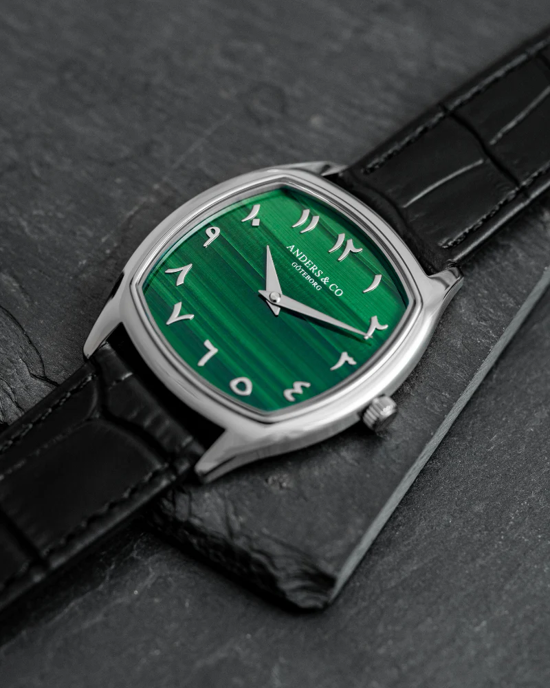
This is probably the most “design-forward” version of the three. Not louder, but more intentional in how it occupies space. It feels like Anders & Co. testing how far they can push their language without breaking it.
Across all three, what remains consistent is the underlying discipline. Case proportions are still right. Nothing oversized, nothing trying to chase presence through dimensions. Finishing is controlled. No unnecessary polish explosions, no texture overload. The watches feel considered, not assembled.
Mechanically, Anders & Co. stay in the same lane. Reliable Quartz and I respect that. The AC2 is not trying to win arguments on paper. It’s trying to make sense on the wrist.
What I appreciate, maybe more than anything else, is that the AC2 Volcán doesn’t feel like a collection designed to fill gaps. It feels like a continuation of a conversation. And from the outside, knowing how Alex thinks, that tracks. He’s not interested in building a catalog. He’s interested in building a language of comfort for those already comfortable with their huge collections.
Are all three versions for everyone? Maybe. The porcelain is almost too pure for some. The onyx too intense. The green too specific. But together, they make sense. They show range without losing identity. And there are many more!
Writing about Anders & Co. is always a bit strange for me because I’m aware of the relationship. But maybe that’s also why I can say this clearly: the AC2 Volcán works because it doesn’t rely on that relationship. It stands on its own, with its own decisions, its own risks.
And if anything, that makes me more interested in what comes next.
Specifications
- Case Material: 316L stainless steel
- Case Diameter: 37 mm
- Case Thickness: 5.65 mm
- Lug Width: 20 mm / 44.6 mm lug-to-lug
- Movement: Miyota 9T22 slim
- Finishes: Mirror-polished & satin-brushed (hand-finished)
- Crystal: Anti-reflective sapphire
- Case-back: Snap caseback
- Strap & Buckle: Genuine leather and steel
- Water Resistance: 3 ATM
Priced at €537,95.
SUBSCRIBE NOW AND NEVER MISS A THING !