I kept going back to the Sero Signature more than I expected, and that’s a huge compliment. It’s one of those watches that only starts to make sense once you begin placing it against other things you already know, once you start measuring it mentally against references that defined this category in the first place. Not to say that it’s « du vu et revu » as in something we’ve seen before, but to hammer down my point that there’s a clear respect of the traditional way of doing things.
Because whether Sero intended it or not, this watch lives in a space that’s already been written. You don’t approach Breguet numerals, a slim manually wound profile, and a restrained case without inevitably entering the orbit of watches like the Patek Philippe Calatrava ref. 96, the Vacheron Constantin ref. 6073, or even more modern reinterpretations like the F.P. Journe Chronomètre Bleu. Different price brackets, different intentions, but the same underlying language. Again, a compliment.
And that’s where the Signature becomes interesting. Not because it competes with those watches (it doesn’t) but because it clearly understands the framework they established.
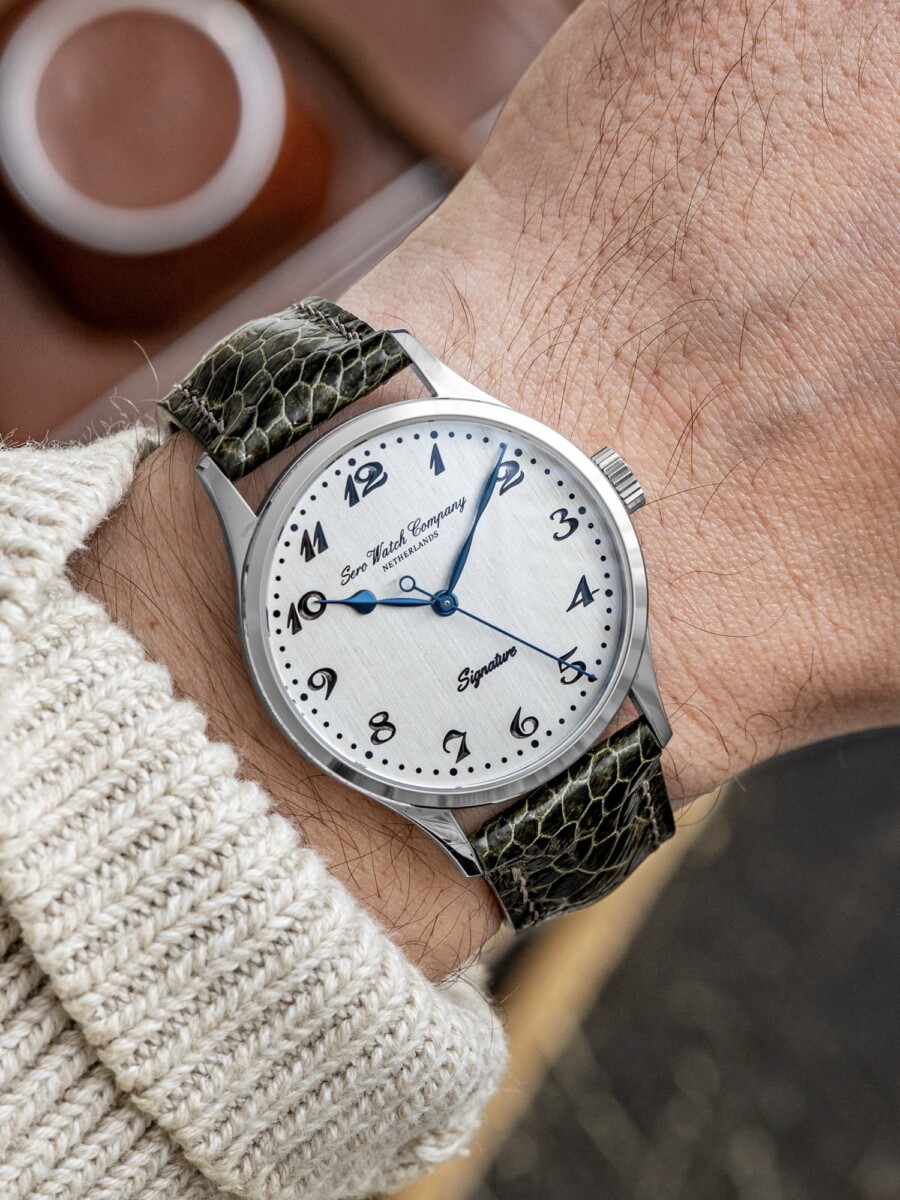
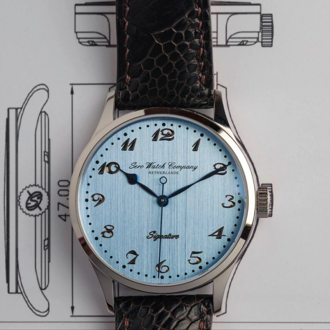
The case proportions are the first indicator. 37.5mm is the easy number to read (sweet!), but the 46.5mm lug-to-lug is where the watch really positions itself. It stretches just enough to avoid that compact, almost fragile stance you get with smaller Calatrava-style pieces. It wears more like certain oversized references from the 40s, where lugs carried more visual weight and extended the watch across the wrist. It’s a subtle shift, but it changes the entire posture of the watch.
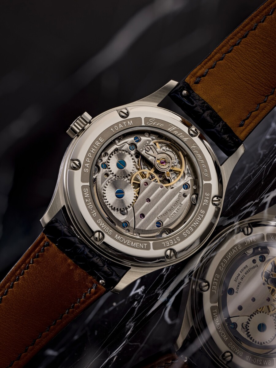
The 9.5mm thickness is exactly where it should be, and that’s largely due to the Sellita SW210-1. There’s nothing mind blowing about that movement, but from a construction standpoint, it’s coherent. Around 3.35mm in height, manual winding, stable architecture. It allows the case to remain slim without forcing the watch into ultra-thin territory, which often introduces compromises in durability or water resistance; AKA having to take it off to wash your hand. The 100 meters rating here is not just a spec, it tells you the case has been built with actual use in mind.
But to get into the main part, the dial is where Sero takes a more deliberate position.
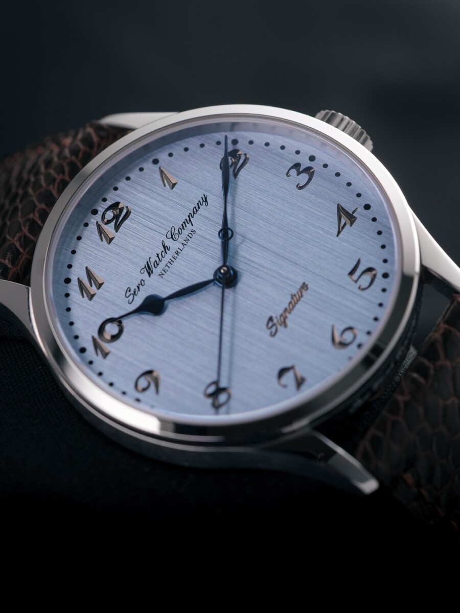
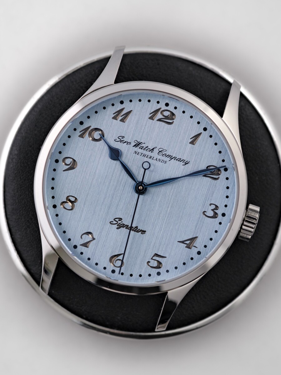
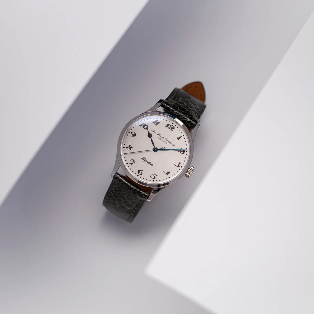
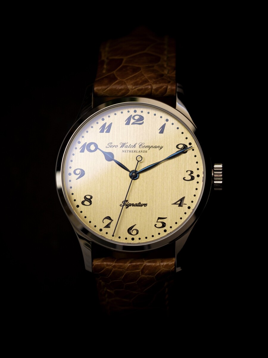
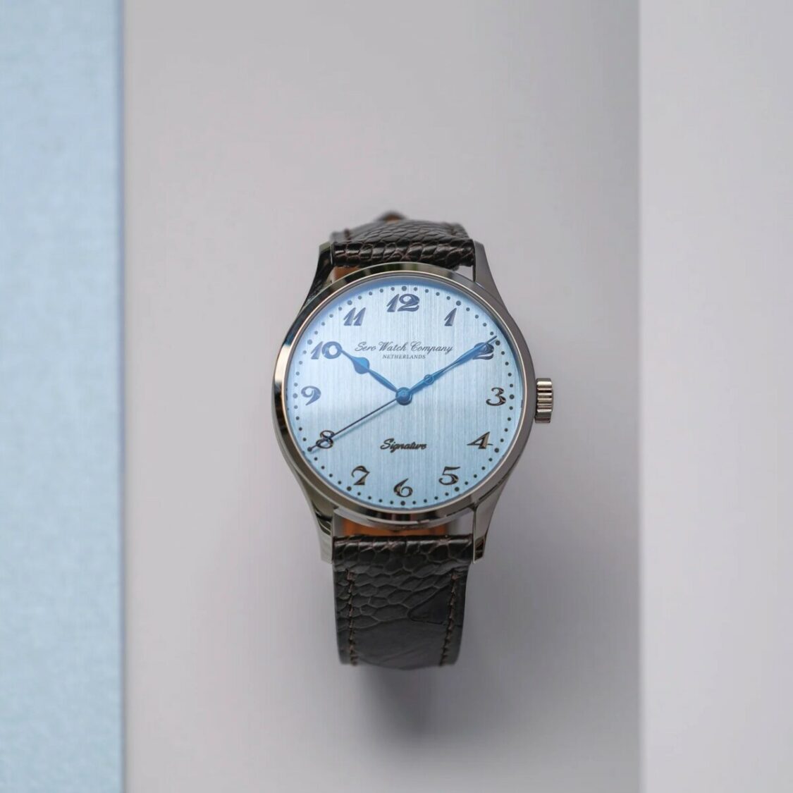
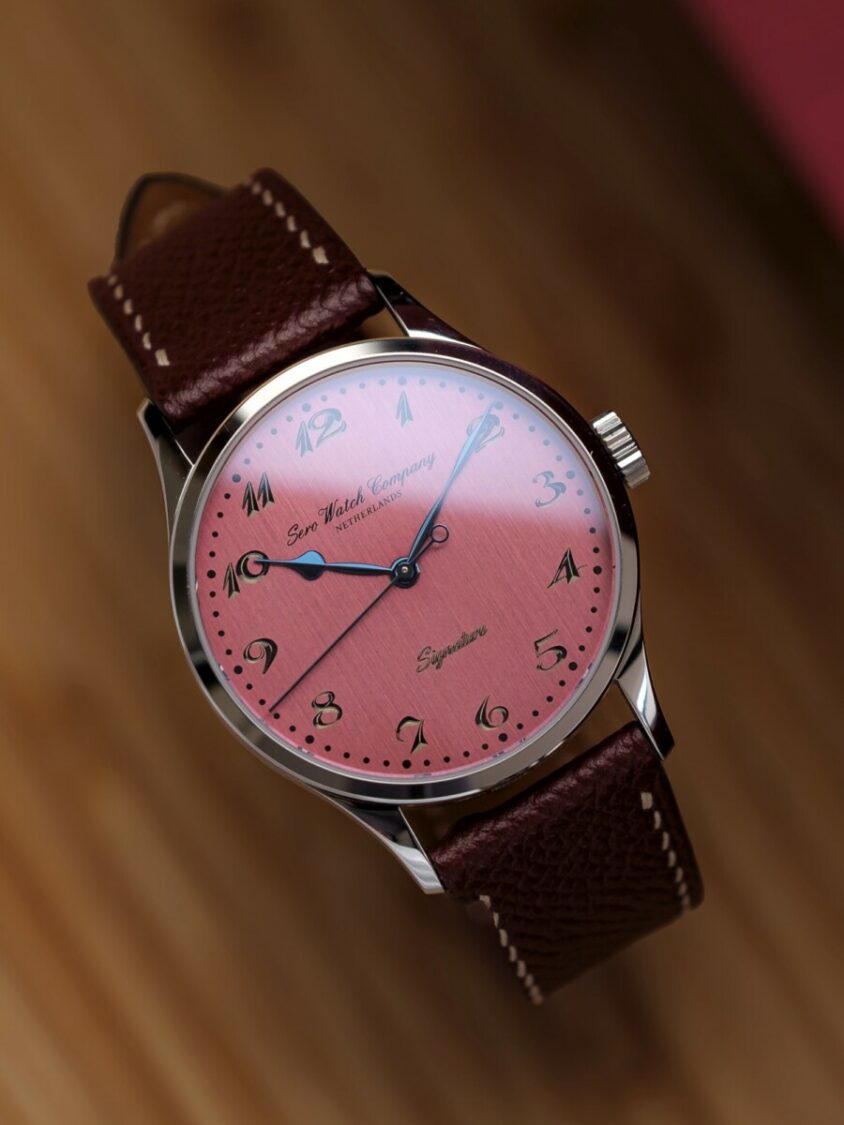
Engraving the numerals directly into the dial instead of printing or applying them changes the reading entirely. From a horological perspective, you move from surface decoration to taking away from the material itself. The numerals exist as negative space, and that means light behaves differently. You don’t get the crisp contrast of printed lacquer or the shadow line of applied markers. Instead, you get something more variable, more dependent on angle and intensity.
This is closer, in spirit, to how traditional guilloché dials interact with light, although achieved through machining rather than hand-turned patterns. The vertical brushing underneath adds a directional grain, which keeps the dial from becoming too static while maintaining control over reflections. It’s a measured approach.
The consistency of execution is what stands out here. The chemin de fer, the numerals, even the signature text all follow the same engraved logic. That avoids the common issue where different techniques compete on the same dial, printed tracks next to applied markers next to stamped logos. Here, everything is resolved within the same surface.
The handset is another area where the watch holds together, and honestly the first thing I noticed. Heat-blued spade hands, correctly dimensioned, doing exactly what they’re supposed to do. The minute hand reaches the track with precision, which is something you’d expect, but not something you always get. The hour hand sits cleanly within the numeral ring, and the seconds hand remains visually light.
It’s basic watchmaking discipline, but it’s often where watches lose coherence.
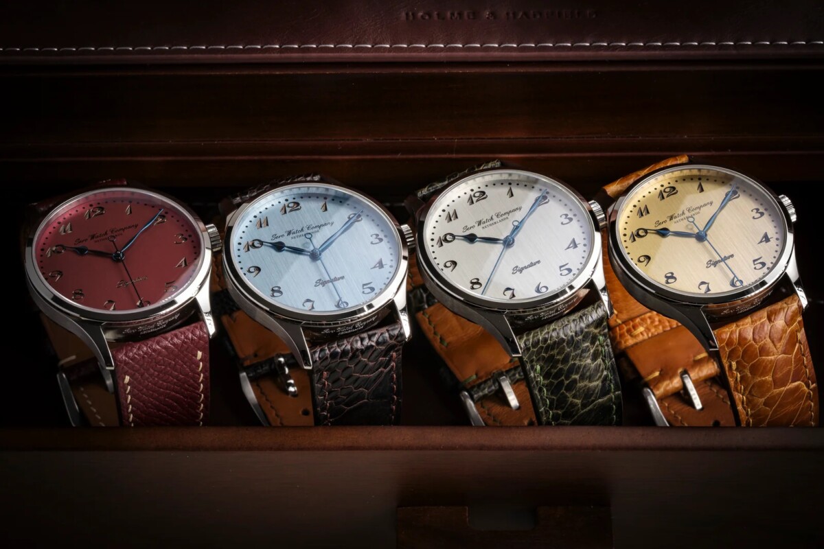
Looking at the different dial configurations, the variations don’t try to reinvent the watch. The silver and champagne dials stay closest to classical references, where the engraving becomes more subtle and the watch reads almost like a study in restraint, to be a little more poetic. The blue dial increases contrast and sharpens the overall presence, pushing it slightly closer to contemporary tastes.
The red dial is the outlier, but it still respects the underlying architecture, which keeps it from feeling disconnected. A little different, but different strokes for different folks.
Now, where the Signature really needs to be placed is in its price segment. At around €1,100 to €1,200, it sits in a very competitive space. You’re looking at watches like the Nomos Tangente, the Longines Heritage Classic, vintage Omegas…
Most of those watches take a different route. Nomos focuses on Bauhaus minimalism and in-house calibres, Longines leans heavily into archival design, vintage Omega Genèves are iconic and reliable. Sero doesn’t really sit directly with any of them. It’s closer to what smaller independent or collector-driven brands have been trying to do in recent years, tightening classical codes rather than reinterpreting them.
That’s also where the watch finds a bit of cultural relevance. There’s been a clear shift in the last few years, especially among younger collectors, away from oversized, overly expressive pieces toward something more controlled. Not necessarily vintage, but informed by it. The Signature fits into that movement as a very clear participant.
That doesn’t make it perfect. The “Signature” text still feels slightly more present than it needs to be when you look at how low-key everything else is, and the longer lug-to-lug will not work for every wrist. But when you place it where it actually belongs, within that €1,000 segment, against watches that often get one or two things right and miss the rest, the Signature holds together in a way that’s harder to dismiss.
What was interesting, and something that came up in conversation with Sergino, the founder, after I shared my thoughts, is that none of this is accidental. The positioning, the proportions, even the way the watch sits in this slightly uncomfortable but very deliberate space, it’s all been thought through.
And that also reflects in how they’re bringing it to market. The initial presale starts just under the €1,000 mark, with the first pieces at €899 before taxes, then €999 during the two-week window, before settling at €1,199 retail. It’s a detail worth mentioning because, at that earlier entry point, the watch shifts slightly in how you evaluate it. You’re no longer just comparing it to its immediate peers, you’re looking at it against a much broader field, and in that context, the level of attention given to proportions, dial execution, and overall coherence becomes harder to overlook.
If I were to discribe it in 1 word, I’d say traditional.
Check them out here.
SUBSCRIBE NOW AND NEVER MISS A THING !