
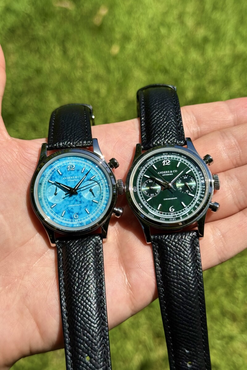
I have a bit of a soft spot for the Anders & Co AC1. I wrote about the original version (salmon dial) back in 2025, when it was still a very young brand trying to prove what it could do with its first watch. I ended up falling pretty hard for it. Since then, I’ve stayed in close contact with Alex Larsson, the founder of Anders & Co, and I’ve had the chance to watch the brand develop from much closer than I normally get to with an independent. What I particularly like about Alex is that he is constantly looking at the details. We’ve spoken about cases, finishing, proportions and all the little things that can make a watch feel different in the hand. So when he started talking to me about the new AC1, I was interested in more than the obvious stone dials. I wanted to see whether all those little improvements had actually made it into the watch.
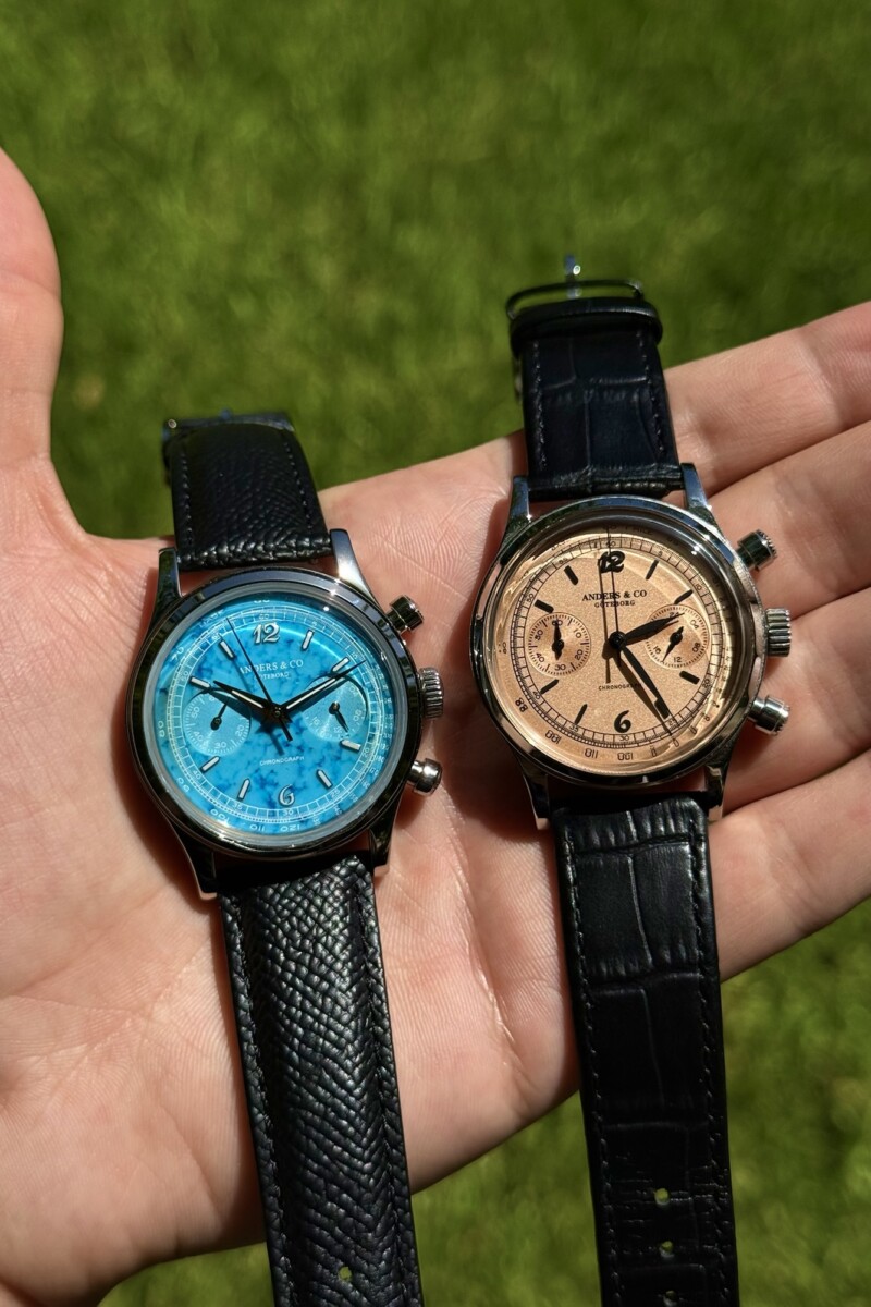
After spending roughly two weeks with both the turquoise and bloodstone versions, I can say that they absolutely have. And I have a slightly annoying problem now: I want both. The new AC1 is not a completely different watch, and I’m glad it isn’t. The proportions remain 38mm in diameter, 11.3mm thick and 46mm from lug to lug, with a 20mm lug width. The Seiko VK64 meca-quartz chronograph is still inside, and the overall vintage-inspired identity is still very much there. But Anders & Co has gone back over the watch and changed a surprising amount without destroying what made the original work. This is exactly the kind of update I like seeing from a young brand. Instead of throwing away the first idea, Alex has taken it apart and asked where it could simply be better.
The biggest difference is the case. On paper, it is still the same 38mm watch, but on the wrist it feels noticeably more refined. The lug geometry has been adjusted so that the lugs have less visual impact, while the profile and bezel transitions have been reworked. The finishing has also been upgraded, with a clearer distinction between the polished and satin-brushed surfaces. This is one of those things that is difficult to explain until you put the old and new versions next to each other. The original AC1 was already a very good-looking watch, but the new one has more definition. It catches the light better and feels more deliberate. Most importantly, it feels a lot more expensive. That isn’t me trying to use the usual review vocabulary. I’ve actually handled both generations, and the difference is obvious.
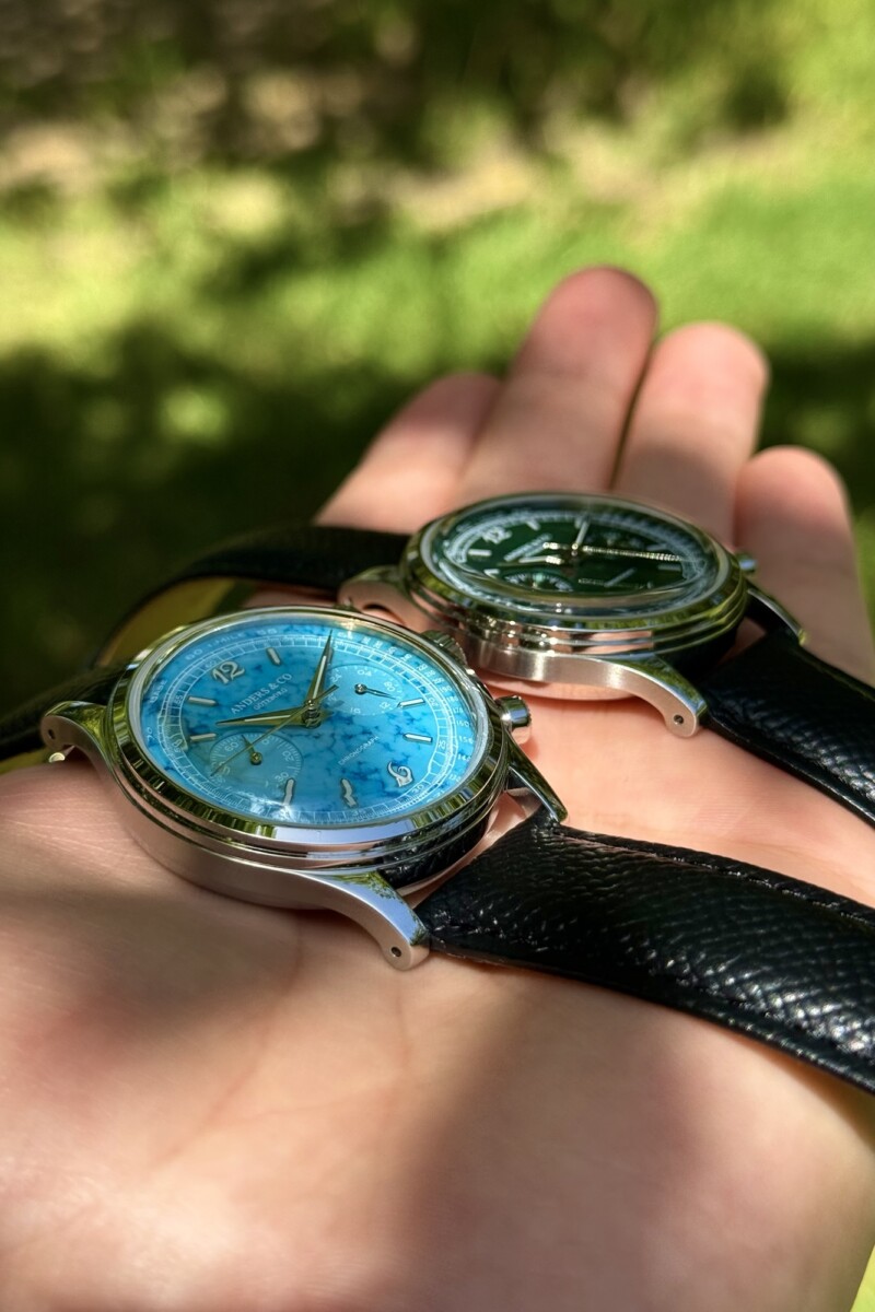
The other case changes are small but genuinely useful. The new AC1 gets drilled lugs, making strap changes considerably easier, and water resistance has gone from 3 ATM, or 30 metres, on my original AC1 to 5 ATM, or 50 metres, today. The crown and round pushers have also been refined. None of these changes are going to make headlines individually, but this is where I think the new AC1 shows how much Anders & Co has matured. The original watch felt like a very good first attempt from a young independent. This one feels like Alex has had enough time with the design to understand where it could be tightened up. I’ve seen him obsess over those details, so seeing them actually arrive on the finished watch is probably more satisfying for me than the stone dials themselves.
The handset is another change that immediately alters the personality of the watch. The original AC1 used leaf-shaped hands, while the new version gets sharp, faceted Dauphine hands with Swiss Super-LumiNova. They give the dial a slightly more serious and refined look, but they also make it easier to read in low light. The dial architecture itself remains familiar, with the tachymeter and minute scale around the outside and the two sub-dials for the 60-minute chronograph and 24-hour indications. Most versions retain the Breguet numerals at 12 and 6, while the red jasper version uses Eastern Arabic numerals instead. I particularly like that Anders & Co has resisted the temptation to clutter the dial simply because it is using stone. There is already a lot happening on a 38mm chronograph, and the restraint keeps everything readable.
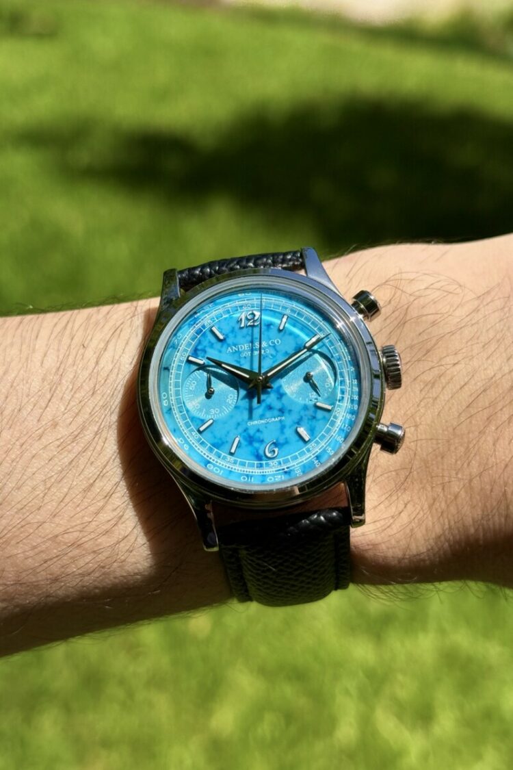
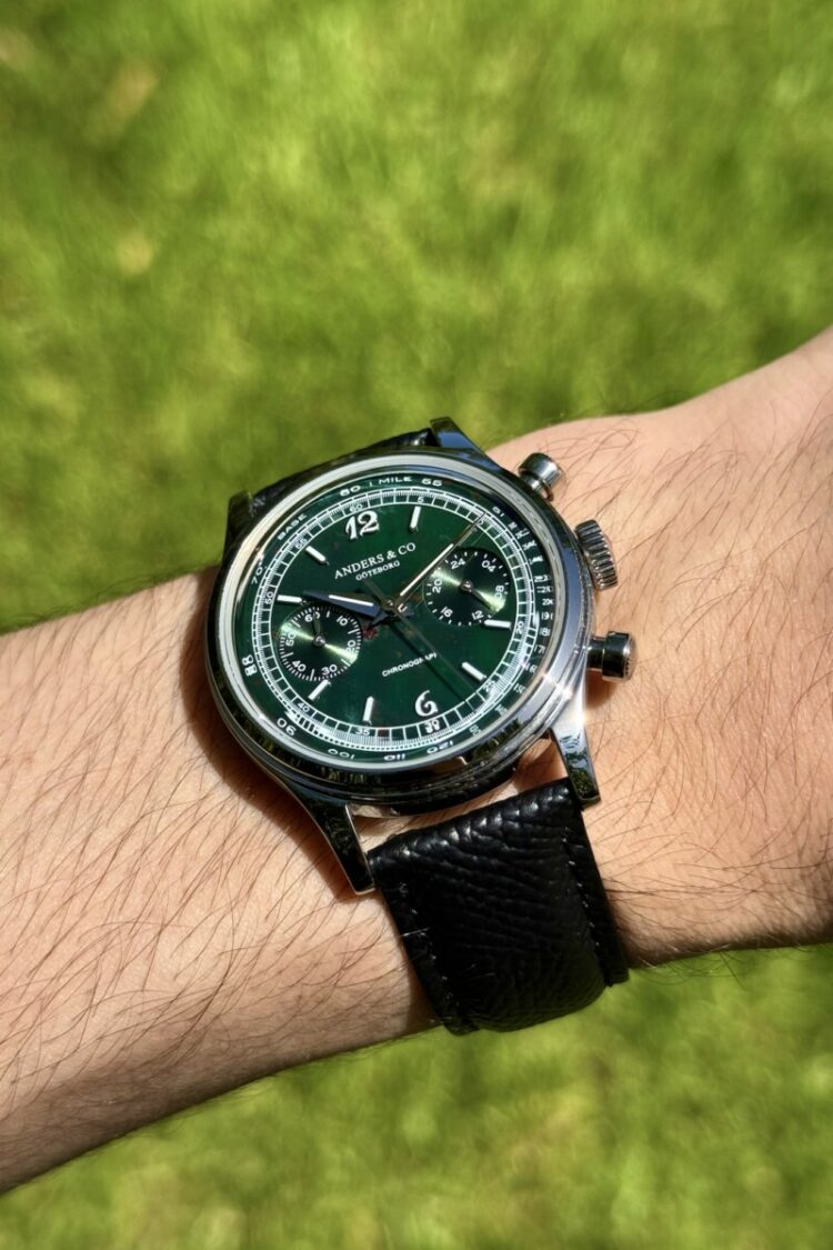
And then we get to the reason everyone is going to notice this new AC1 in the first place. Anders & Co has taken five natural stones and put them into a chronograph that, until now, had been much more traditionally dressed. There is white mother-of-pearl, black onyx, red jasper, turquoise and bloodstone. Each dial is naturally different, so these aren’t just five colours that happen to be available in a catalogue. The stone itself becomes part of the personality of the individual watch. This is something Anders & Co has already become known for through the AC2, so bringing that language back to the watch that started the brand makes a lot of sense.
I was particularly interested in the turquoise and bloodstone because I actually got to live with them instead of simply handling them at an event. The turquoise is the obvious attention seeker. It has this incredible colour and natural variation, but what makes it work for me is the contrast with the very traditional chronograph design underneath it. You still have the Breguet numerals, tachymeter, sub-dials and vintage proportions, so the watch never becomes a fashion piece with a random stone stuck into it. It is still an AC1. It just happens to have a very loud personality now. And I love that. It is the kind of watch that makes you look down at your wrist for no reason other than you want to see what the stone is doing in the light.
The bloodstone is where things became difficult for me. It is much more restrained and, from a distance, can look almost black or very dark green. Then you move your wrist and those natural red inclusions suddenly appear. Time+Tide picked up on exactly this when they handled the watch, and I completely agree: the bloodstone has a depth that is difficult to appreciate properly in photographs. It is also the one I found myself wearing when I wanted something a little less obvious. The turquoise says, “look at me.” The bloodstone waits until you actually look. After two weeks of swapping between them, I still cannot choose. I genuinely want to wear both at once, which is not particularly helpful when you’re supposed to be writing a review.
The double-domed sapphire crystal is also worth mentioning because it was one of the details I loved about the original AC1, and thankfully it remains. The crystal has anti-reflective coating, and the dome works particularly well with these stone dials because it creates another layer between your eye and the surface of the stone. On my original AC1, I wrote about how the crystal helped reveal details in the dial and gave the tachymeter scale that slight magnified effect around the edges. That same quality is still here, but the natural variation of the stone makes it even more interesting. You can look at the same watch ten minutes apart and get a completely different impression depending on the light.
The movement is unchanged, and I honestly don’t think that is a problem. The Seiko VK64 is still the engine, giving the AC1 its meca-quartz chronograph functionality. You get quartz-regulated timekeeping and the tactile operation of a mechanical chronograph, without the cost and maintenance associated with a fully mechanical chronograph movement. It also has no conventional running-seconds sub-dial, with the second sub-dial instead functioning as a 24-hour indicator. I know some collectors will immediately ask why Anders & Co didn’t make the jump to a mechanical calibre, but I think that would actually distract from what makes the AC1 good. At this price, I would much rather see the money going into the case, finishing, crystal and dial than into a mechanical movement purely so the specification sheet can say “mechanical.”
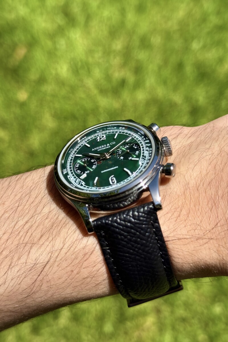
And this is probably why I like the new AC1 more than I expected. It doesn’t feel like Anders & Co is desperately trying to make the second version look different. It feels like Alex is simply getting better at making the watch he wanted to make in the first place. The case is more refined, the finishing is better controlled, the lugs are more practical, the water resistance is higher, the hands are better resolved and the stone dials bring an entirely new personality to the design. The dimensions remain exactly where I think they should be, so the watch hasn’t lost that compact, old-school feeling that made me like the original in the first place.
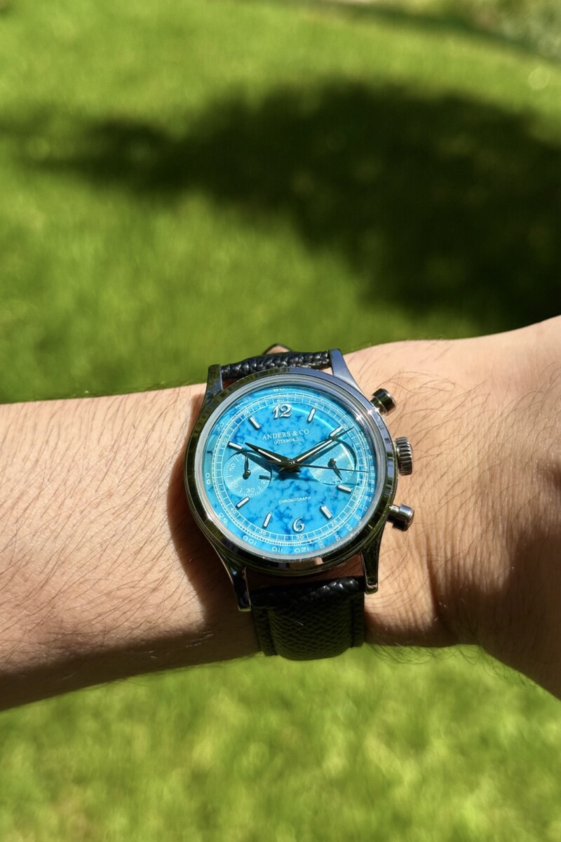
That is also what makes having followed Alex’s work particularly interesting for me. When you know the founder and you’ve seen the process, you start noticing things differently. I’ve watched him improve Anders & Co detail by detail, and the new AC1 feels like the result of that process. It isn’t perfect because it suddenly costs ten times more or because there is some exotic movement hidden underneath the dial. It is better because the person making it has become more demanding of his own work. That is probably the most convincing sign of a young independent brand growing up.
When I wrote about the original AC1, I called it a reminder of tradition. I still see that in the new one, but now I see something else too: progress. The AC1 hasn’t lost its identity, and it hasn’t tried to become something it isn’t. It has simply become sharper, more refined and, frankly, more expensive-looking. And then Alex went and put turquoise and bloodstone on it, which has left me with the completely unnecessary problem of wanting two versions of the same watch.
The turquoise is the one I keep looking at. The bloodstone is the one I wear for day-to-day tasks. So yeah, Alex. I think you’ve done it again.

SUBSCRIBE NOW AND NEVER MISS A THING !