Get this, what do you think would happen if we mixed Brutalist Architecture with an asymmetrical Cellini Midas case inspo ? Well, that’s what Toledano & Chan did with the B/1.

Before we get going, let me present myself to you Time-Telling Magazine readers. I’m Taha, a new writer here at the Time-Telling Mag.
I got into the world of watches around 3 years ago because of social media, and the algorithm was convinced that it had to show me content about classic men’s style. Around that time, the “Old Money” aesthetic was quite the hot topic. Consequently, the classic leather strap watches were everything I could ever gush about and more.
Yet, for me, that wasn’t just a trend or a passing wave. My love for watches just got deeper and deeper with time. At first, it was promoted to me as a stylish item, an accessory. Then, it took on a more materialistic-status-symbol connotation . Fast forward today, I can’t look at or think about watches as anything else other than ART ! I enjoy exploring JLC and Patek’s websites the same way I enjoy art museums.
These time telling pieces are a way of self-expression, and a marker of significant life events (They could also be my version of a “Love Language”, who knows?)
Now that I gave you guys a rough idea about who I am, let me introduce you to a watch that has occupied my consciousness -and unconsciousness- as of late.
Last December, I was watching Teddy Baldassarre’s “Our Most Worn Watches Of The Year for 2024” video, and it’s there where I saw the B/1 for the first time. I know, I’m late to the bandwagon. At that moment my dear friends, I said to myself “Wow! Now that’s an interesting timepiece”. So naturally, I went on a frenzy trying to learn everything about everyone who made this breathtaking ticking piece of concrete. But more on that later.

I’ll be completely transparent with you. The brand Toledano & Chan amazed me in a way that I have never experienced before.
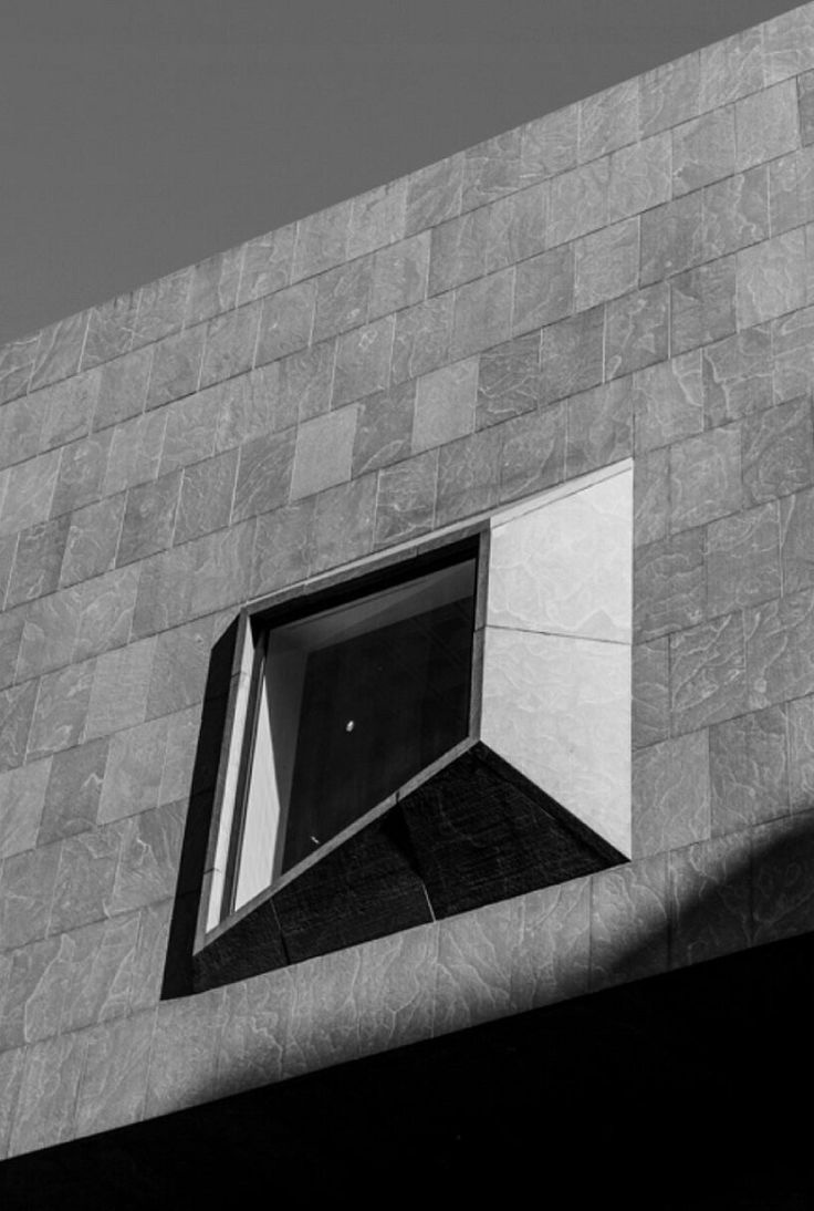
The two founders Phil Toledano and Alfred Chan took inspiration from the early 70’s Geezer watches, especially the Rolex Cellini Midas. This would seem completely logical if you knew who Mr Toledano is and what he is known for. What makes our geezers’ watch special, is that they combined everything above with a Brutalist Architecture inspo. Hence the “… piece of concrete” line I pulled earlier.


I will be explaining in greater detail the provenance and significance of this architectural movement by the end of this article. Stick around !!
I’m confident that if your “watch guy of a friend” came to you with a similar idea, you would have told him to go F off and watch some Nico Leonard. Because in my humble opinion, nobody would have pulled it off with such incredible levels of class and sleekness as these two gentlemen right here. This bold idea gave us something UNIQUE. Something we sadly don’t see very often nowadays.

Toledano & Chan is obviously an independent watch brand, co-founded by Phillip Toledano, a conceptual artist, watch collector, and entrepreneur. And Alfred Chan, an automotive designer turned watch visionary. This is a very young brand, established in May of 2024, and who didn’t procrastinate in giving the world of watchmaking an absolute masterpiece. Their B/1.
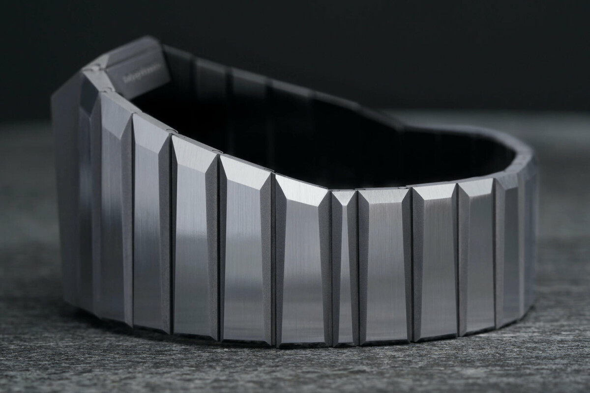
You can’t ignore the B/1! You can’t ignore a 32mm Lug-Width watch that looks like a block of concrete sculpted straight out of an Eastern-European building. And behind that crystal that resembles a window of a brutalist residency, lays a mesmerizing blue Lapis lazuli stone dial. The time-piece comes in stainless steel, which is perfect in this context, to feel the rigid and tough aspect of brutalist buildings. Side note, and I know that this is unfair, but imagine, just imagine how cool it would’ve been if it was made in titanium…

An interesting detail about the B/1 is that it’s a Destro watch (Destro comes from the italian word for “right”), meaning that it’s a watch worn on the right wrist. I know, this is very much psycho behavior.
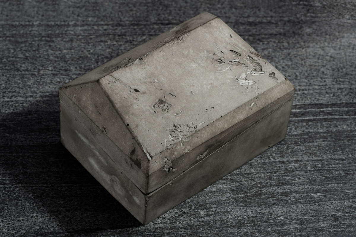
The B/1 comes in a box, naturally. One that absolutely blew my mind. Why ? It’s a handmade box that perfectly reflects the brand’s inspiration from Brutalist Architecture.
Just look at how harsh and dominant that box is. It gives you that cold industrialist feeling, very far from the usual warm wood or leather watch boxes.
T&C state in their website that it’s a concrete box. In full honesty guys, this little detail made me pull a confused emoji face as the BS alarms started to go off in my head. So I did some research to check, and it looks like it’s made from unpolished aluminium, and that’s how it took its brutal look. I also spoke to Walid, Time-Telling’s founder and someone with an architecture degree, and he told me that if it were actually made out of concrete, it would weigh around 10 Kg LOL.

One thing to keep in mind is that the brand will soon be releasing their B/1.2, which not only features a mother of pearl dial, but also a beautiful asymmetrical crystal that continues the case’s shape. I lost it when I saw it for the first time, and I couldn’t help but feel convinced that we’ll be seeing these guys around for quite some time.
Mr Toledano said that he noticed a negative space left in the B1 case, which then sparked the idea of continuing on the same design path for the B/1.2, thus the idea of stretching the dial and crystal for that irregular shape.

Both the B/1 & 1.2 come with the Swiss made automatic movement Sellita SW100, with a power reserve of 42 hours, at a price tag of $4,000 for the B/1, and $5,700 for the B/1.2; available in March, 2025.
Let me make it clear, I love this watch. I’d be over the freaking moon if I ever got my hands on one. My colleague Inass however – the beloved Time-Telling writer and editor – said that it looks like a Cybertruck. A fair comparison to be made.


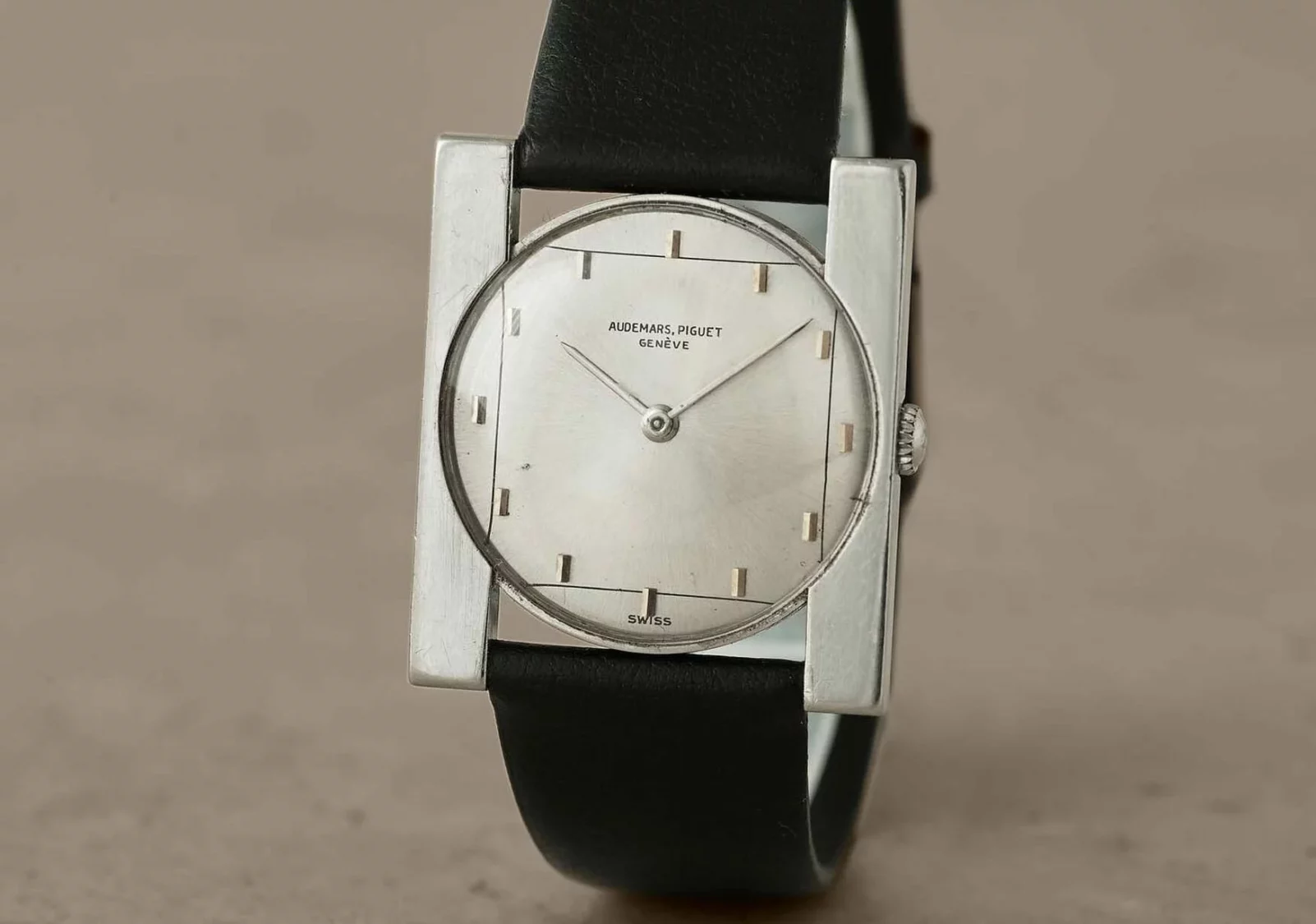
Besides Toledano & Chan, there are other brands who got inspired by brutalism to design their watches (Just be patient, we’ll talk about brutalism right after this), for example:
- Alto ART 01
- Audemars Piguet [Re]Master 02
- Audemars Piguet ref. 5179 (1961)


Brutalism is the highlight of this article. We wouldn’t be going bonkers over this watch if the inspiration behind it didn’t have such significant historical value. So let’s dig in.
The term Brutalism originated from the French word “Béton Brut”, which translates to raw concrete, and if you’ve ever seen a brutalist building, you’ll quickly get it.
Brutalism gets its special monochromatic character due to the use of exposed concrete shaped in bold, huge, often creepy structures in geometric forms such as cubes, cylinders, and triangles.
Personally, whenever I see a brutalist building, I imagine myself in an Eastern-European country where the weather is freezing cold, the sky is full of grey clouds, and melancholy is taking over people. This dark architectural style also reminds of some of PNL (French rap group) video clips like “DA”, “Naha”, and “Deux Frères”.


Brutalist Architecture gained popularity after WW2 (Late 1940’s – Early 1950’s). Governments needed to rebuild destroyed cities in a cost-effective way, and concrete was a great option for them.

Plenty of people link Brutalism with the Swiss-French architect, Le Corbusier, who introduced the idea of primarily using reinforced concrete in post-war constructions.
Le Corbusier built the “Unité d’Habitation” in Marseille, 1952. A residential project that made the foundation for future Brutalism.

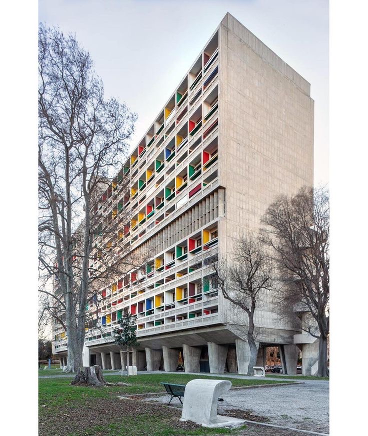
Other popular Brutalist buildings that we can mention are:
- The National Theater in London, UK – Sir Denys Lasdun (King Charles III said that it looks like a nuclear power station HAHA)
- Boston City Hall, Boston, USA – Kallmann, McKinnell & Knowles
- Habitat 67, Montreal, Canada – Moshe Safdie (Very interesting idea)
- Western City Gate, Belgrade, Serbia – Mihajlo Mitrović
- The Soviet Palace of Culture and Science, Warsaw, Poland – Lev Rudnev (Took all the Aura in my opinion)


Brutalism started to fade out in the late 70’s due to the “inhumane and alienating” perception of these buildings. The spread of crime and poor living conditions in those social housing programs, as well as the welcoming of the more lively postmodernism style, were some of the most influential causes of its descent from grace.


My dear friends, this is farewell. I can’t describe how much I enjoyed writing this article, and I am looking forward to putting out more of my interests out here for you guys.
See ya!
*We do not own the rights to any of these photos. please note that all images and copyrights belong to their original owners. no copyright infringement intended.*
SUBSCRIBE NOW AND NEVER MISS A THING !


Great article!